Best Thumbnail Designs for YouTube Videos
How to Create the Best Thumbnail Designs for YouTube
In the massive, fast-moving ecosystem of digital video, content creators face an ongoing battle for user attention. Every minute, hundreds of hours of video are uploaded to YouTube, creating a highly competitive environment where only the visually distinct survive. While many creators invest countless hours into scriptwriting, high-definition filming, and meticulous editing, they frequently relegate the video thumbnail to an afterthought. This approach can severely limit a channel’s growth. The thumbnail is not merely a decorative graphic; it serves as the digital storefront for your content and is the single most critical factor in determining whether a user decides to click on your video or scroll past it.
The connection between thumbnail design and video performance is rooted in a fundamental metric: Click-Through Rate (CTR). YouTube’s algorithm tracks how many users click on a video after seeing it on their homepage, in subscription feeds, or in recommended sidebars. A high CTR signals to the platform that your content is engaging, relevant, and appealing to audiences. Consequently, the algorithm rewards that video with broader distribution, creating a powerful compounding cycle of traffic and growth.
When two videos offer similar information or production value, the video paired with the superior thumbnail design will consistently outperform its competitor. Understanding how to master the custom YouTube thumbnail is a critical requirement for anyone serious about building an audience. This comprehensive guide details the psychological triggers, design principles, and practical strategies necessary to create high-performing, click-worthy thumbnails that drive consistent channel growth.
Read: Manual Penalty Removal in SEO: Strategies and Best Practices
What Is a YouTube Thumbnail and Why Is It Important?
A YouTube thumbnail is a static, reduced-scale preview image that represents a video on the platform’s search results, homepage, and recommendations layout. It functions as a visual billboard, offering a brief summary of the video’s premise. In an environment where viewers make browsing decisions in fractions of a second, the thumbnail serves as the primary tool to capture interest and establish relevance.
The importance of this asset cannot be overstated, as it directly impacts every critical performance metric on the platform:
-
Click-Through Rate (CTR): This metric measures the percentage of impressions that turn into views. If a thumbnail fails to catch the eye or explain the value proposition instantly, the CTR plummets, and the video stalls.
-
Total View Count: High-performing thumbnail designs open the gate for initial traffic. Without a compelling entry point, even the most exceptional video content remains undiscovered.
-
Watch Time Accumulation: When a custom YouTube thumbnail aligns perfectly with the actual content of the video, it sets accurate user expectations. This alignment reduces early drop-offs, ensuring viewers stay engaged longer and boost total watch time.
-
Accelerated Channel Growth: A cohesive and recognizable design framework builds brand awareness. When users repeatedly see high-quality, familiar images, they begin to trust the creator, leading to increased subscriber acquisition.
Prominent creators allocate significant time and resources solely to thumbnail production. They understand that the success of a major production depends heavily on that single preview image.
Read: How Long Does It Take to Rank in Google?
Key Statistics
Audience behavior data demonstrates that the vast majority of users make viewing choices based on visual cues rather than text-based titles. The human brain processes visual imagery significantly faster than text. As a result, users evaluate a thumbnail and make a conscious decision to watch or scroll in less than two seconds.
The YouTube recommendation algorithm continuously monitors these split-second interactions. When a newly published video achieves a high CTR, the system interprets it as a strong positive engagement signal and expands its distribution. Conversely, a low CTR signals poor user alignment, causing the platform to reduce the video’s visibility across user feeds.
Understanding the Psychology Behind High-Performing Thumbnails
Creating effective thumbnail designs for YouTube requires a solid understanding of visual psychology. Exceptional design relies on specific triggers that prompt human curiosity, emotion, and action.
Curiosity Gap
The curiosity gap is the cognitive space between what a viewer currently knows and what they want to know. High-performing thumbnails leverage this concept by presenting a compelling visual puzzle, an unexpected scenario, or an unfinished narrative. By showing a compelling outcome without revealing the exact process, the design creates an information deficit. The viewer experiences a strong urge to resolve this tension, which they can only do by clicking the video to uncover the solution.
Emotional Triggers
Human decisions are driven heavily by emotion, and visual assets that evoke strong feelings consistently generate higher engagement. Creators can target several primary emotional states:
-
Surprise and Shock: Showcasing unexpected reactions or bizarre anomalies instantly breaks up the monotony of a standard user feed.
-
Excitement and Anticipation: Bright, dynamic setups convey energy, making the underlying content feel vital and engaging.
-
Fear and Urgency: Presenting a common problem, a costly mistake, or a looming risk triggers a protective instinct, compelling viewers to click for self-education.
-
Happiness and Relatability: Warm smiles, comforting environments, and familiar settings foster an immediate sense of trust and connection.
Visual Hierarchy
Visual hierarchy is the deliberate arrangement of graphic elements to guide the viewer’s eye in a specific, intentional sequence. An effective layout ensures that the most critical piece of information—whether it is a human face, a primary object, or a short text phrase—is noticed first. Secondary elements should then support and expand on that primary focal point. Without a deliberate hierarchy, a design becomes chaotic, forcing the user’s brain to work too hard to decode the image, which usually results in them scrolling past.
Pattern Interrupts
The standard YouTube feed is a dense grid of competing images, many of which share similar styles, layouts, and color palettes within specific niches. A pattern interrupt is a design choice that purposefully breaks this conformity. By using contrasting color schemes, unusual compositions, or distinct framing techniques, a creator can interrupt the user’s passive scrolling behavior, forcing them to pause and look closely at the asset.
Human Faces and Eye Contact
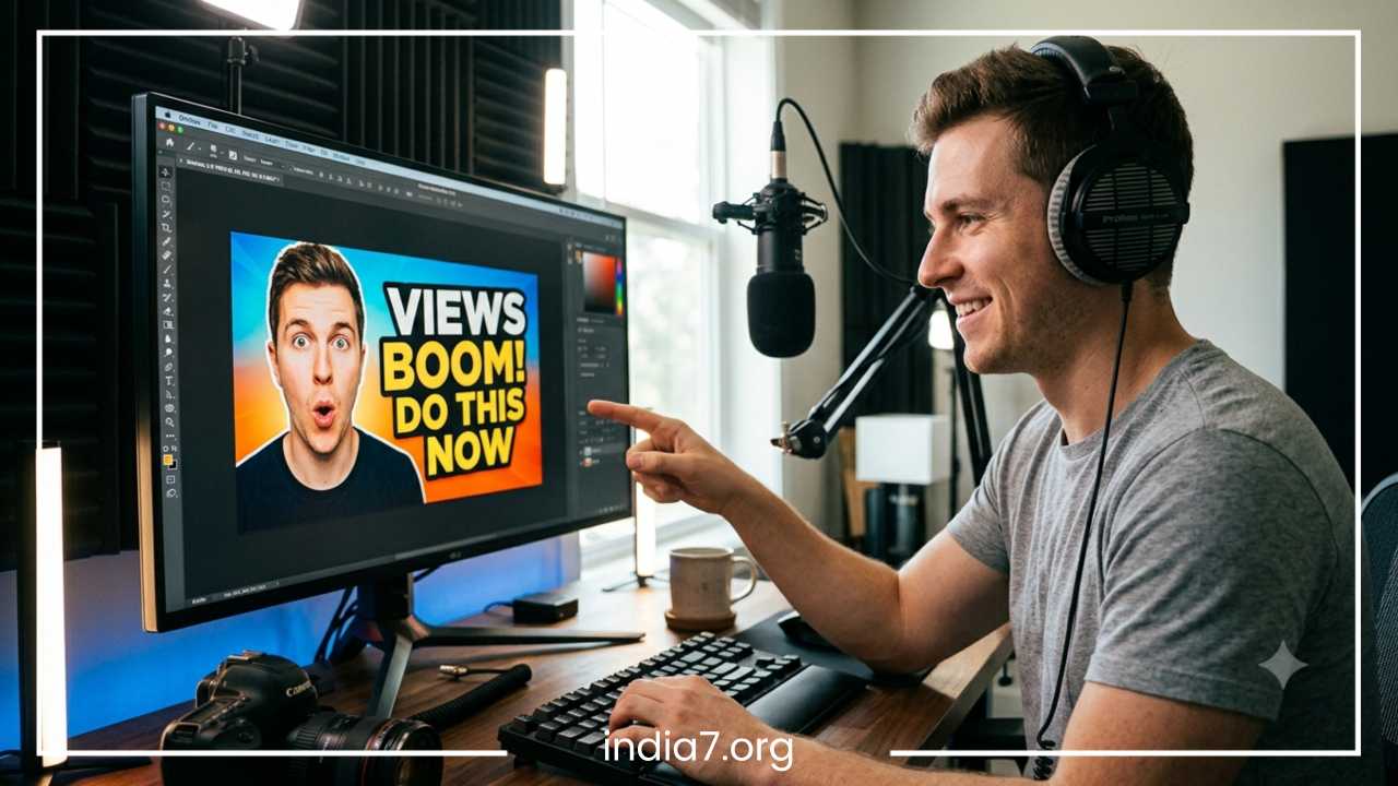
Humans are biologically programmed to look at faces and interpret facial expressions. Integrating a clear, expressive human face into a thumbnail design can substantially increase engagement. When the subject looks directly out of the frame, it creates a simulated sense of eye contact, building an immediate psychological connection with the viewer. The expression must be clear and exaggerated enough to remain readable at smaller sizes, instantly communicating the emotional context of the video.
Read: How Many Keywords Can You Rank for with One Page?
Essential Elements of an Effective YouTube Thumbnail
To design a high-quality thumbnail that converts impressions into views, creators must combine several foundational graphic elements into a cohesive layout.
Bold and Readable Text
Text on a thumbnail should complement the video title, not repeat it. The text must be highly readable, using a concise phrase of three to five words. Because a significant portion of YouTube traffic comes from mobile devices, fonts must be large, heavy, and clear of unnecessary decorative elements.
High-Quality Images
Blurry, pixelated, or poorly cropped screenshots degrade the perceived quality of a video. High-performing layouts use sharp, high-resolution original photographs or carefully extracted graphical assets. Using dedicated cameras or high-quality lighting for thumbnail photography ensures that the subject remains crisp, clean, and professional across all screen resolutions.
Strong Contrast
Contrast prevents visual elements from blending into one another. High contrast can be achieved by placing light-colored text against dark backgrounds, using bright outlines around subjects, or separating foreground items from background environments with artificial lighting effects. A well-designed image maintains clear separation between all its component parts.
Focal Point
An effective layout centers around a single, dominant focal point. Trying to showcase multiple subjects, complex backgrounds, and long text strings creates visual clutter. The most successful graphics feature one clear subject—such as a single face, an isolated product, or a specific object—making the underlying premise immediately obvious.
Branding Elements
Long-term channel growth relies heavily on visual consistency. Incorporating a unified brand identity helps regular viewers identify your content instantly in a crowded feed. This can be achieved through consistent color palettes, signature typography, subtle logo placements, or a repeating structural layout.
| Design Element | Primary Function | Common Mistake to Avoid |
| On-Screen Text | Reinforces context and adds a hook | Repeating the title or using small fonts |
| Subject Imagery | Serves as the central focal point | Using low-resolution or dark screenshots |
| Color Scheme | Grabs attention and sets the tone | Clashing palettes that cause visual fatigue |
| Branding Accents | Establishes long-term recognition | Changing styles drastically every upload |
Choosing the Right Colors for YouTube Thumbnails
Color choices play a major role in visibility and emotional messaging. The right palette can elevate a simple graphic, while a poor color scheme can obscure important details.
Best Attention-Grabbing Colors
The YouTube user interface is primarily composed of white, black, and light gray backgrounds. To stand out against this default environment, creators should use vibrant, high-saturation colors. Red, yellow, orange, and neon green are highly effective options. However, because red is used in YouTube’s own branding and progress bars, secondary accents like bright blue, yellow, and green are often safer choices to ensure maximum separation from the platform’s interface.
Color Psychology
Colors trigger specific psychological associations in the human mind. Understanding these connections allows creators to choose palettes that match the emotional tone of their videos:
-
Yellow and Orange: Evoke optimism, energy, and warmth; highly effective for lifestyle, travel, and mainstream entertainment.
-
Blue and Teal: Convey professionalism, security, trust, and intellect; frequently used by tech reviewers, corporate channels, and educational creators.
-
Green: Associates with growth, wealth, health, and success; the standard choice for financial advice, business tutorials, and fitness content.
-
Purple and Pink: Suggest creativity, luxury, luxury items, and alternative perspectives; popular in beauty, design, and commentary niches.
Contrast Techniques
To maximize text legibility and subject clarity, designers use specific contrast techniques. One reliable approach is using complementary colors—shades that sit opposite each other on the color wheel, such as blue and orange, or yellow and purple.
Placing a warm-colored subject against a cool-colored background makes the subject pop forward naturally. Additionally, applying dark drop shadows, thick black strokes, or semi-transparent dark shapes beneath white or yellow text guarantees readability regardless of background complexity.
Common Color Mistakes
A frequent error in thumbnail design is using too many competing colors, which creates visual noise and dilutes the focal point. Conversely, using low-contrast combinations—such as dark gray text on a black background, or light yellow text on a white background—renders text unreadable on mobile screens. Creators must also avoid muddy, overly desaturated tones that make content look unprofessional and unappealing.
Typography Tips for Better Thumbnail Design
Typography is a powerful tool for adding context and narrative value to your custom YouTube thumbnail. Choosing, sizing, and placing text correctly can directly impact your click-through rate.
Best Fonts for Thumbnails
The best thumbnail fonts are heavy, thick sans-serif typefaces. Serif fonts, cursive scripts, and overly decorative typefaces feature thin lines that often disappear or become unreadable when scaled down to mobile screen sizes. Industry-standard typefaces include Impact, Bebas Neue, Montserrat, Montserrat Black, Futura Bold, and Arial Black. These fonts feature uniform line weights and wide letter structures, making them highly legible from a distance.
Text Placement
Text placement must be handled carefully to avoid overlapping key visual subjects like faces or focal objects. Additionally, creators must never place critical text or important visual details in the bottom-right corner of the design. YouTube overlays a permanent video runtime stamp in this exact location across search results and recommendation feeds, which will obscure any design elements beneath it.
Text Size Guidelines
Designers should adopt a mobile-first approach to text sizing. A font size that looks perfectly readable on a large desktop monitor may become completely illegible when viewed on a mobile device. To ensure accessibility, text should occupy a significant portion of the layout, and individual letters must be spaced far enough apart to prevent them from blurring together at smaller scales.
What to Avoid
When formatting on-screen text, avoid long sentences or full paragraphs. The thumbnail is a visual hook, not a script. Do not use complex text effects like multi-colored gradients, excessive glows, or intricate 3D distortions that reduce clarity. Keep the text styling clean, direct, and uniform across the entire canvas.
Thumbnail Design Strategies Used by Top YouTubers
Analyzing successful creators reveals several recurring design frameworks that consistently capture audience attention across different industries.
Minimalist Thumbnails
The minimalist framework relies on extreme simplicity to cut through visual noise. These designs feature a single, high-definition subject set against a clean, uncluttered background, often completely omitting text. This style builds an air of elegance, mystery, or high production value. It is highly effective for tech reviewers or luxury travel vloggers who rely on pristine visual aesthetics to attract viewers.
Expression-Based Thumbnails
Commonly used by entertainment, gaming, and reaction channels, this format places a large, high-contrast cutout of a human face in the foreground. The face displays a clear, intense emotion—such as wide-eyed shock, deep anger, or intense joy. The background usually showcases a dramatic scene or an item related to the video’s theme. This layout leverages human empathy, encouraging viewers to click to find out what caused such an extreme reaction.
Before-and-After Designs
This layout splits the thumbnail canvas into two clear sections: a left side showing a problem or a starting point, and a right side showing the final solution or transformation. A split-screen design provides immediate visual proof of value. It is widely used by fitness channels tracking physical transformations, restoration channels, home renovation creators, and DIY tutorial platforms.
Challenge and Transformation Thumbnails
Popularized by high-budget entertainment creators, this strategy showcases an extreme, high-stakes situation or an ambitious goal. The layout often features the creator interacting with an impressive object, a massive structure, or a demanding environment, paired with a subtle progression bar or a countdown graphic. This setup promises high-energy entertainment and a clear narrative arc, driving strong viewer curiosity.
Mystery-Based Thumbnails
This framework intentionally hides a key piece of information using strategic blur effects, silhouettes, large question marks, or clever framing. By concealing the final product, a secret guest, or the final result of an experiment, the design forces the viewer to click the video to satisfy their curiosity and uncover the hidden details.
Step-by-Step Process to Create a YouTube Thumbnail
Developing a structured, repeatable design workflow helps ensure quality and consistency with every video upload.
Step 1: Understand the Video’s Main Promise
Before opening any graphic design software, define the core value proposition or central hook of the video. The thumbnail must communicate this central premise clearly, working alongside the title to tell a cohesive story.
Step 2: Sketch Thumbnail Concepts
Brainstorm two or three distinct visual layouts. Decide where to place the primary subject, where the text will sit, and what color palette will best convey the video’s emotional tone. Planning the composition early prevents messy layouts down the line.
Step 3: Select Strong Visual Assets
Gather your raw media assets. This may involve taking a dedicated, high-resolution photograph during filming, extracting a clean 4K video frame, or sourcing premium graphical elements. Clean up your main subject by removing distracting backgrounds with a precise cutout tool.
Step 4: Add Text Strategically
Place your chosen text phrase onto the canvas, keeping it within three to five words. Apply a clean, heavy sans-serif font and position it safely away from the bottom-right corner. Use contrasting background shapes or drop shadows to ensure the text stands out from the imagery behind it.
Step 5: Optimize Colors and Contrast
Adjust the global visual properties of the canvas. Increase the saturation slightly to make colors pop, raise the contrast to clarify foreground and background separation, and apply sharpening filters to ensure the image remains crisp at smaller viewing sizes.
Step 6: Test on Mobile Devices
Scale down your completed design to ten percent of its original size, or view it directly on a mobile screen. Check to ensure that the facial expressions remain recognizable, the text is easily readable, and the overall composition remains clear at a smaller scale.
Step 7: Export Correctly
Save the finalized image using the correct technical parameters. Export the file in an approved format, ensuring the final file size stays under the platform’s maximum upload limit to avoid upload errors.
Best Tools for Designing YouTube Thumbnails
Creators can choose from a wide range of software options based on their budget, design experience, and specific production needs.
Beginner-Friendly Tools
For creators who lack formal graphic design training, web-based applications like Canva offer an accessible entry point. These platforms feature drag-and-drop interfaces, pre-made template libraries, simple background removal tools, and built-in typography presets. They allow beginners to produce clean, well-proportioned thumbnails quickly without having to learn complex design workflows.
Professional Design Software
Advanced creators who require complete creative freedom and precise control typically use professional software like Adobe Photoshop or Affinity Photo. These desktop applications offer advanced layer management, non-destructive editing filters, precise masking tools, complex color correction suites, and professional text effects. They enable designers to create highly detailed compositions, custom lighting effects, and seamless image composites.
AI Thumbnail Tools
Artificial intelligence tools are becoming a valuable asset in modern design workflows. Generative AI tools can create unique custom backgrounds, expand existing image frames, or generate stylized graphical assets from simple text prompts. Additionally, AI-driven data platforms allow creators to upload multiple thumbnail options, using predictive algorithms to analyze layout clarity and estimate real-world viewer engagement before the video goes live.
Common YouTube Thumbnail Mistakes to Avoid
Even experienced creators can fall into common design traps that hurt their click-through rates and limit channel growth.
Clickbait Without Delivery
While a thumbnail should be engaging and dynamic, it must accurately reflect the actual content of the video. Using misleading graphics, fake circles, or exaggerated scenarios that never appear in the video breaks trust with the audience. This practice leads to low audience retention, high bounce rates, and negative algorithmic signals that ultimately reduce the channel’s long-term visibility.
Too Much Text
Trying to cram a long sentence or a full video title onto a thumbnail canvas is a common mistake. Excess text creates visual clutter, reduces font legibility, and overwhelms the viewer, causing them to move on to simpler, cleaner designs.
Cluttered Designs
A cluttered layout features too many subjects, chaotic background details, multiple logos, and competing text blocks all fighting for attention. High-performing thumbnail designs prioritize simplicity, utilizing clean negative space to let the central subject breathe and stand out.
Poor Image Quality
Using low-resolution graphics, blurry screenshots, or poorly lit photos gives your content an unprofessional look. Viewers often associate low thumbnail quality with low video production value, driving them to seek out cleaner, more professional options.
Inconsistent Branding
Changing fonts, layout structures, and color schemes radically with every new upload prevents your audience from developing visual familiarity with your channel. Maintaining a cohesive design language helps regular viewers instantly recognize your content in their feeds.
Ignoring Mobile Users
Designing solely on a large desktop monitor without checking how the asset looks on a smartphone screen is a costly mistake. If your text, facial expressions, or key details become unreadable at smaller sizes, you miss out on a massive portion of the mobile viewing market.
Copying Competitors Too Closely
While studying successful competitors is useful for research, cloning their exact layouts, fonts, and imagery hurts your channel’s identity. If your content looks identical to existing videos, it struggles to stand out, and viewers have less reason to choose your video over an established creator’s.
A/B Testing and Optimizing Your Thumbnails
Thumbnail design is an iterative process. Launching a video is simply the first step; maximizing its long-term reach requires continuous monitoring, testing, and optimization based on real performance data.
Why Testing Matters
No matter how experienced a creator is, it is impossible to predict exactly how an audience will react to a specific design. A/B testing allows creators to upload two different thumbnail versions for the same video. YouTube’s platform then distributes both variants to similar audience groups, collecting real-time performance data to determine which design achieves a higher click-through rate.
Metrics to Monitor
When evaluating thumbnail performance, creators must closely track several interconnected metrics in their analytics dashboard:
-
Click-Through Rate (CTR): The primary indicator of a thumbnail’s initial appeal. A sudden drop in CTR usually suggests that the visual asset is failing to capture attention.
-
Impressions: The total number of times your thumbnail is shown to users. High CTR leads to more impressions over time.
-
Average View Duration (AVD): If a high-CTR thumbnail is paired with low view duration, it indicates a disconnect between the thumbnail’s promise and the actual video content.
When to Change a Thumbnail
If a video features strong topic relevance and high audience retention but suffers from low views, a weak click-through rate is often the culprit. In these situations, replacing the underperforming asset with a fresh design—featuring brighter colors, larger text, or a clearer focal point—can revitalize the video, prompting the algorithm to distribute it to new audiences.
YouTube Thumbnail Specifications and Best Practices
To ensure your custom YouTube thumbnail renders cleanly across all platforms, devices, and resolutions, you must follow YouTube’s official technical specifications.
Recommended Size
The ideal resolution for a standard YouTube thumbnail is 1280 × 720 pixels. While the platform scales the image down across search feeds, it uses this higher resolution when the video is embedded on external websites or viewed on large smart televisions. This ensures the graphic remains sharp and professional in every viewing context.
Aspect Ratio
Thumbnails must be designed using a 16:9 aspect ratio. This widescreen format is the standard layout for YouTube’s player and feed architecture. Using alternative aspect ratios can result in awkward black bars appearing on the sides of your design, or parts of your image being cropped out.
File Types and Size
The platform accepts several standard image file formats, including JPG, JPEG, GIF, and PNG. For designs that feature fine text and crisp graphical elements, exporting as a high-quality PNG is often the best choice to avoid compression artifacts. Additionally, the final file size must stay under 2 MB. If your file exceeds this limit, reduce the image quality settings slightly or compress the file before uploading.
Safe Zone Layout Guidelines
-
Left Side and Center: Place your primary subject, expressive faces, and large action-hook text here. This is the prime real estate that catches the eye first during a passive scroll.
-
Top-Right Corner: Good for secondary text or minor supporting graphics.
-
Bottom-Right Corner: Leave this completely empty or fill it only with a non-essential background. YouTube overlays a permanent video runtime stamp in this exact location across search results and recommendation feeds, which will obscure any design elements beneath it.
Future Trends in YouTube Thumbnail Design
The visual landscape of online video is constantly evolving, driven by changing user preferences, new technologies, and shifting platform algorithms.
AI-Assisted Workflows
Artificial intelligence tools are rapidly moving from novelty options to core components of the design workflow. Creators increasingly use intelligent segmentation tools to isolate subjects instantly, use generative fill to build custom backgrounds, and rely on machine learning models to run automated clarity and contrast audits before publishing.
Return to Authenticity
After years of highly saturated, over-edited designs, a growing trend is shifting toward clean, minimalist realism. Audiences are showing increased interest in authentic, unedited documentary-style photography that feels candid and trustworthy, moving away from overly dramatic expressions and artificial glowing effects.
Data-Driven Development
The era of guessing what works is giving way to precise, data-backed optimization. With integrated platform testing tools becoming widely available, creators can base design choices on direct audience data rather than creative intuition alone. This data-driven approach allows for rapid testing of text placement, color palettes, and framing styles to maximize CTR.
Final Thoughts
Mastering the art and science of thumbnail design is an essential skill for long-term growth on YouTube. An effective thumbnail serves as a visual bridge connecting your target audience with your content. By combining clean layout principles, strong color contrast, readable typography, and proven psychological triggers, you can build a reliable system for converting impressions into views.
Always design with a mobile-first mindset, prioritize clarity over complexity, and ensure your visual assets accurately reflect the true value of your videos. Treat your thumbnails as vital marketing assets rather than quick afterthoughts. With a consistent, structured design workflow and continuous performance testing, you can steadily improve your click-through rates, expand your viewer base, and unlock your channel’s full potential.
Frequently Asked Questions
How do I design a YouTube thumbnail that increases click-through rate?
To design a thumbnail that maximizes your click-through rate (CTR), focus on the “three-element rule”: include one expressive human face, one clear focal object, and a maximum of three to five bold words. Use a high-contrast color scheme, such as a bright yellow font set against a deep blue or dark gray background, to ensure the imagery pops when users scroll through their feeds. Finally, always keep the bottom-right corner clear of text or crucial visual details so it does not get covered by YouTube’s native video timestamp overlay.
What is the best free YouTube thumbnail maker for beginners?
Canva is widely considered the best free web-based tool for beginners due to its intuitive drag-and-drop interface and vast collection of pre-made templates. Other excellent free options include Figma and GIMP, which offer more advanced layer controls and customization options but come with a slightly steeper learning curve. For mobile-first creators, mobile apps like PixelLab and Phonto offer powerful, free typography tools to build crisp text overlays directly on a smartphone.
Why do my YouTube thumbnails look blurry on mobile devices?
Thumbnails usually appear blurry on mobile screens due to incorrect canvas resolution or heavy file compression. Even though mobile screens are small, YouTube requires an optimal canvas size of 1280 by 720 pixels. If you export your file at a lower resolution or pull a low-quality, static screenshot directly from your video editing timeline, the platform’s compression algorithm will distort the lines. Always use high-resolution original photos and apply a subtle sharpening filter before exporting to keep the image crisp at any size.
Should I change underperforming thumbnails on older YouTube videos?
Yes, updating underperforming thumbnails on older videos is a highly effective strategy to revive a stagnant channel. If your analytics show that an older video has a solid average view duration but a very low click-through rate, it means the content is good but the visual gateway is failing. Designing a fresh, high-contrast custom thumbnail can satisfy the algorithm’s performance signals, prompting YouTube to test the video with completely new audiences.
How do I do keyword research for YouTube video topics?
The most reliable way to find high-volume search phrases is by using the search bar autocomplete feature on YouTube and Google. Start typing your primary topic and review the automated drop-down predictions, as these reflect actual terms real users are searching for. You can also monitor the “Research” tab directly inside your YouTube Studio dashboard or use dedicated keyword tools like vidIQ and TubeBuddy to analyze the exact monthly search volume and competition level for your specific niche.


