Top Ways to Design Engaging Pinterest Pins
Top Ways to Design Engaging Pinterest Pins: Boost Your Clicks
Pinterest is often misunderstood as just another social media platform where people post photos of their lunch or vacation. In reality, it is a powerful visual search engine and a massive driver of high-quality traffic. Unlike platforms like Instagram or X, where content has a shelf life of mere hours, a well-designed Pinterest pin can continue to drive traffic to your website for months or even years.
However, the competition on Pinterest is fierce. Millions of pins are uploaded every day, and users scroll through their home feeds at lightning speed. To succeed, you cannot simply create “pretty” pins; you must create “clickable” pins. A pretty pin might get saved to a board and forgotten, but a clickable pin forces the user to stop scrolling, engage with the content, and follow the link to your website.
In this guide, we will explore the comprehensive strategies required to design pins that don’t just sit there looking good, but actively work as a marketing funnel for your brand. You will learn the science of visual hierarchy, the psychology of click-through rates (CTR), and the technical specifications required to dominate the Pinterest feed.
Read: Unleashing Collective Creativity: A Guide to Open Innovation
Understanding How Pinterest Works
To design effective pins, you must first understand the environment in which they live. Pinterest functions more like Google than Facebook. Users go there with intent—they are looking for solutions, inspiration, or products to buy.
A Visual Search Engine
Because Pinterest is a search engine, your design must communicate its purpose instantly. The Pinterest algorithm uses visual discovery technology to “read” your images. It identifies objects, colors, and text within the pin to determine what the content is about. This means your design is part of your SEO. If your pin is about “healthy meal prep,” but the image is a blurry photo of a messy kitchen, the algorithm—and the user—will struggle to categorize it.
How the Algorithm Prioritizes Content
The Pinterest algorithm favors content based on several key factors:
-
Relevance: How well your pin matches a user’s search query or interests. This is determined by your keywords and the visual clarity of the design.
-
Engagement: Pins that receive clicks and saves are pushed to more users. High CTR is the ultimate signal to Pinterest that your content is valuable.
-
Freshness: Pinterest prioritizes new images. Designing multiple unique pins for the same URL is a standard practice for maintaining reach.
By focusing on high-quality design, you are directly influencing these algorithmic factors. A clear, professional design improves relevance, while a compelling hook improves engagement.
Read: Easy Ways to Increase Office Productivity
Psychology Behind High-Performing Pins
Pinterest users are “skimmers.” They scan the feed vertically, looking for something that resonates with their current needs. Understanding the psychology of this behavior is the secret to moving from “ignored” to “engaged.”
Curiosity Gaps and Value Propositions
The most successful pins utilize a “curiosity gap.” This is the space between what a user knows and what they want to know. If your pin tells the whole story, there is no reason to click. Instead, your design should present a problem or a transformation and promise the solution behind the click.
At the same time, you must offer a clear value proposition. Within two seconds, a user should know exactly what they will get if they click your pin. Clarity always beats creativity. A clever, abstract design might look artistic, but if the user has to work to understand it, they will keep scrolling.
Emotional Triggers
Pins that perform well usually hit one of three emotional notes:
-
Aspiration: Showing the user what their life could look like (e.g., a beautifully organized pantry).
-
Urgency: Highlighting a mistake they might be making or a limited-time opportunity.
-
Problem-Solving: Directly addressing a pain point (e.g., “How to stop your indoor plants from dying”).
Read: How and Why Every Business Can Be Highly Successful?
Ideal Pinterest Pin Dimensions and Formats
Technical accuracy is the foundation of a good pin. If your dimensions are wrong, Pinterest may crop your content or lower its distribution in the feed.
The Golden Ratio: 2:3
The standard and most effective aspect ratio for Pinterest is 2:3. The recommended size is 1000 x 1500 pixels. Because Pinterest is a vertical feed, taller pins take up more “real estate” on the screen, making them more likely to catch the eye.
Choosing Your Format
-
Static Pins: The bread and butter of Pinterest. These are single images that are perfect for blog posts, products, and evergreen content.
-
Video Pins: These are excellent for tutorials or showing a product in action. They often auto-play in the feed, which is a massive advantage for grabbing attention. Keep them between 15 and 60 seconds for maximum impact.
-
Idea Pins: These are multi-page sets of content. While they are great for building brand awareness and engagement within the platform, they traditionally haven’t allowed for direct outbound links in the same way static pins do. Use them to build your following.
Creating Scroll-Stopping Visual Design
Once you have the dimensions right, it’s time to focus on the aesthetics that drive action.
Color Psychology
Color is the first thing a user perceives. High-contrast designs stand out against the white background of the Pinterest interface.
-
Warm Colors: Reds, oranges, and pinks tend to see higher engagement and save rates than cool blues and greens.
-
Brand Strategy: While you want to stand out, you also need to stay “on brand.” Use your brand’s primary colors as accents or background elements to build recognition.
-
Contrast: Ensure there is a stark difference between your text color and your background. Dark text on a light background or white text on a dark overlay is a safe and effective bet.
Typography That Converts
The majority of Pinterest users are on mobile devices. If your text is too small or too decorative, it becomes unreadable.
-
Readability: Use bold, sans-serif fonts for your main headlines. They are easier to read at a glance.
-
Font Pairing: A common technique is to pair a bold headline font with a simpler supporting font. Avoid using more than two or three different fonts on a single pin, as this creates visual clutter.
-
Avoid Script Fonts: While beautiful, script and “handwritten” fonts are notoriously difficult to read on small screens. If you must use them, use them for a single, unimportant word rather than your main keyword.
Image Selection
The background image sets the stage for your message.
-
Lifestyle vs. Stock: Authentic, lifestyle imagery that shows a human element or a real-life scenario usually outperforms generic stock photos. People want to see the “end result” of what you are offering.
-
Faces vs. Objects: Interestingly, Pinterest’s own data has shown that pins without faces sometimes perform better because they allow the user to project themselves into the image. However, this varies by niche. In the coaching or personal branding niche, a face builds trust.
Layout and Composition
-
Rule of Thirds: Place your focal point (the object or the text) along the imaginary grid lines that divide the image into thirds.
-
White Space: Don’t feel the need to fill every inch of the pin. “White space” or “negative space” allows the eye to rest and highlights the most important elements.
Writing Click-Worthy Pin Titles (Text Overlay)
Text overlay is perhaps the most important element for driving clicks. This is the text that you place directly on the image.
Why Text Overlay Matters
Many users don’t read the actual pin description or title until after they have been intrigued by the image. The text on the pin itself is your “headline.”
Headline Formulas
Use proven formulas to grab attention:
-
The Listicle: “7 Steps to a Minimalist Home.”
-
The Transformation: “How I Doubled My Traffic in 30 Days.”
-
The Fear of Missing Out: “5 Mistakes You’re Making With Your Skincare.”
-
The Tutorial: “The Ultimate Guide to Sourdough Baking.”
Keep it Short
You have limited space. Aim for 4 to 8 words. If your headline is too long, the font size will have to be smaller, which kills mobile readability. Use “power words” like Proven, Secret, Easy, Free, or Essential to add weight to your message.
Branding Without Being Overpowering
Your pins should look like they belong to you, but they shouldn’t look like an advertisement.
Consistent Templates
Developing a set of 5 to 10 templates ensures that your feed looks cohesive. Use the same font pairings and color palette across your pins. Over time, your followers will recognize your content before they even see your name.
Logo Placement
Always include your logo or your website URL on your pins. This prevents people from “stealing” your content and ensures that even if the pin is shared a thousand times, your brand remains attached to it. Place it at the top or bottom center, and make it subtle. It shouldn’t compete with the main headline.
Using Templates to Scale Your Pin Design
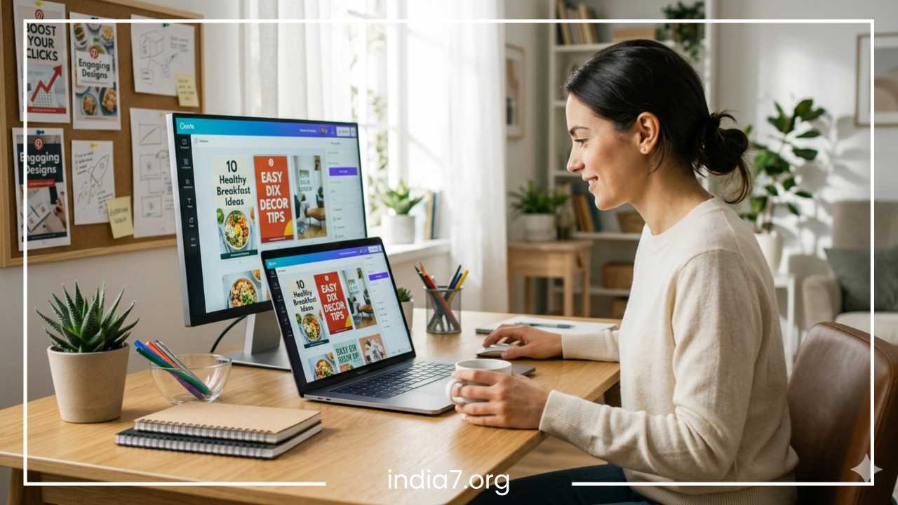
Designing every single pin from scratch is an inefficient use of time. Professional Pinterest marketers use templates to maintain a high volume of fresh content.
Tools for Success
Tools like Canva and Adobe Express are industry standards. They offer pre-made Pinterest dimensions and allow you to save your brand colors and fonts.
Avoiding Template Fatigue
While templates are great for speed, using the exact same layout for every single post can make your profile look stale. To avoid this, create several variations of your templates. For one post, you might use a “Large Image + Top Text” layout. For the next, you might use a “Collage + Middle Text” layout. This keeps your feed looking dynamic while maintaining brand consistency.
A/B Testing Your Pin Designs
You never truly know what will resonate with your audience until you test it. A/B testing (or split testing) involves creating two or more versions of a pin for the same link and seeing which one performs better.
What to Test
-
Headlines: Test a “How-to” headline against a “Listicle” headline.
-
Images: Test a photo of a finished product against a photo of the product being used.
-
Colors: Test a bright yellow background against a neutral white one.
-
Call to Action: Test “Read More” versus “Download Now.”
Measuring Performance
Don’t just look at impressions. An impression means someone saw it, but a click means they were interested. Focus on your outbound click rate. If Pin A has 1,000 impressions and 10 clicks, but Pin B has 500 impressions and 15 clicks, Pin B is the winner despite having less “reach.”
Common Pinterest Design Mistakes to Avoid
Even seasoned designers fall into these traps:
-
Overcrowded Designs: Trying to put too much information on one pin. If a user has to squint to see what’s happening, you’ve lost them.
-
Hard-to-Read Fonts: Using light-colored text on a light background or using “girly” scripts that look like scribbles on a phone screen.
-
No Clear Message: Using a beautiful photo of a forest for a blog post about “Financial Planning.” The visual must match the topic.
-
Ignoring Mobile: Always preview your pins on a mobile device. If the text is hard to read, go back and make it bigger.
-
Low-Resolution Images: Blurry or pixelated images make your brand look unprofessional and untrustworthy.
Optimizing Pins for Clicks (Not Just Saves)
There is a big difference between a “Save” and a “Click.” A save means the user wants to look at it later; a click means they want to see it now.
Designing for Action
To encourage clicks, you need to make a promise. If your pin says “Blueberry Muffin Recipe,” that’s okay. But if it says “The Secret to Bakery-Style Blueberry Muffins (Ready in 20 Minutes),” you are promising a specific outcome and a specific benefit (speed and quality).
Matching Design with Content
Ensure the “vibe” of your pin matches the destination page. If your pin is bright, energetic, and modern, but your website is dark, moody, and traditional, the user will feel a “bounce” effect. They will feel like they clicked the wrong link and leave immediately.
Using Subtle CTAs
While Pinterest isn’t as aggressive as Instagram with “Link in Bio,” a small, tasteful Call to Action (CTA) on the pin can significantly boost CTR. Phrases like “Click to see the full list,” “Get the free template,” or “Read the guide” give the user a clear instruction on what to do next.
Advanced Strategies for Higher Engagement
Once you have the basics down, you can start using advanced tactics to stay ahead of the curve.
Seasonal Design Trends
Pinterest is a seasonal platform. People start searching for Christmas ideas in September and summer travel in January. Adjust your design aesthetic to match the season. Use “cooler” tones for winter-themed content and “vibrant, warm” tones for summer content.
Repurposing Top Performers
Look at your analytics. If a specific pin from six months ago is still driving traffic, analyze why. Is it the color? The headline? The image? Create three new variations of that pin using the same winning elements. This is the fastest way to scale your traffic.
Multiple Pins Per Post
For every blog post or product page, aim to create at least 3 to 5 different pins. One might focus on a “problem,” one on a “solution,” and one might be a simple “lifestyle” shot. This allows you to capture different segments of your audience.
Tools and Resources for Pinterest Designers
You don’t need to be a professional graphic designer to create high-performing pins.
-
Design Software: Canva is the most user-friendly option for beginners. Adobe Illustrator or Photoshop are better for those who want total control over every pixel.
-
Stock Photos: Use sites like Pexels, Unsplash, or Pixabay for high-quality, free imagery. For more unique, premium photos, consider Ivory Mix or Styled Stock Society, which specialize in Pinterest-friendly aesthetics.
-
Font Pairing: Websites like Fontjoy or Google Fonts can help you find two fonts that complement each other perfectly.
-
Color Palettes: Use Coolors.co to generate high-contrast color schemes that will stand out in the feed.
Real Examples and Case Studies
Consider a hypothetical case study of a travel blogger.
The Problem: The blogger was posting “pretty” landscape photos of Italy with small, white text at the bottom. The pins were getting thousands of impressions but only a 0.2% click-through rate.
The Redesign:
-
They switched to a 2:3 vertical ratio.
-
They added a dark semi-transparent overlay to the middle of the image.
-
They used a bold, yellow font for the headline: “10 Things I Wish I Knew Before Visiting Rome.”
-
They added a small button-style graphic at the bottom that said “Read the Guide.”
The Result: The outbound click-through rate jumped to 1.5%. While the impressions stayed roughly the same, the actual traffic to the website increased by over 700%.
The lesson here is that the image itself (the “pretty” landscape) wasn’t enough. It needed the context and the “hook” provided by the text overlay and the layout.
Step-by-Step Workflow
Follow this repeatable system to ensure every pin you create is optimized for success:
-
Analyze the Destination: Look at your blog post or product. What is the single most important “pain point” it solves?
-
Keyword Research: Use the Pinterest search bar to see what terms people are using. (e.g., “Minimalist bedroom ideas”).
-
Create the Headline: Write 3 variations of a headline using the formulas mentioned earlier.
-
Select the Visual: Choose an image that clearly represents the topic. Ensure it is high resolution.
-
Design the Pin: Open your template. Drop in the image, apply your brand colors, and add your headline. Ensure the text is large enough to read on a phone.
-
Add Branding: Place your website URL or logo at the bottom.
-
Export and Optimize: Save as a high-quality PNG. When uploading, ensure your Alt Text and Pin Title match the keywords used in your design.
-
Publish and Track: Pin it to the most relevant board first. Check back in 14 days to see the click-through rate.
Final Thoughts
Designing engaging Pinterest pins is a blend of art and data. While it is important to have a pin that looks professional and reflects your brand, it is even more important to have a pin that speaks to the user’s needs and triggers their curiosity.
Success on Pinterest does not happen overnight. It requires consistent experimentation and a willingness to look at your analytics to see what is actually working. Don’t be afraid to try “ugly” designs if they drive clicks, and don’t get too attached to “beautiful” designs if they aren’t performing.
By focusing on the 2:3 ratio, high-contrast text, clear value propositions, and mobile-first design, you will be well on your way to turning Pinterest into a massive traffic source for your business. Start today by taking one of your existing blog posts and creating three different pin variations for it. Test, learn, and repeat.
Frequently Asked Questions
What is the ideal Pinterest pin size for mobile users?
The best dimensions for Pinterest pins are 1000 x 1500 pixels, maintaining a 2:3 aspect ratio. Since over 80% of Pinterest users access the platform via mobile devices, vertical pins are essential. This specific ratio ensures your content takes up the maximum amount of screen real estate without being cropped by the algorithm, which often happens with “super long” pins.
How do I increase Pinterest click through rate for my blog?
To boost your outbound clicks, focus on text overlay clarity and high-contrast design. Use bold, sans-serif fonts that are easy to read on small screens and include a clear call to action, such as “Download the Guide” or “See the Full Recipe.” Aligning your pin headline with the specific search intent of your audience is the most effective way to turn impressions into website traffic.
How many keywords should I use in a Pinterest pin description?
For optimal Pinterest SEO, aim for one primary keyword in your pin title and two to four supporting long-tail keywords within your description. Avoid keyword stuffing; instead, write natural, helpful sentences that explain what the user will find when they click. Including your main keyword in the text overlay of the image also helps the Pinterest algorithm categorize your content more accurately.
Does the Pinterest algorithm prioritize video pins over static images?
While static pins are the workhorse for driving consistent website traffic, video pins often receive higher engagement and priority placement in the home feed. The movement of video naturally catches the eye in a static scroll. For the best results, use short videos (15–60 seconds) to provide a “teaser” or tutorial, then link to your blog for the full detailed experience.
How often should I create new pin designs for the same link?
Pinterest favors fresh content, which means you should ideally create 3 to 5 unique pin designs for every blog post or product page. By changing the background image, testing different headlines, or shifting your color palette, you can reach different segments of your audience and find which visual “hook” performs best without needing to write new blog posts constantly.
Can I use Pinterest pins to rank on Google search results?
Yes, Pinterest pins are highly indexable. By using SEO-optimized titles and detailed descriptions, your pins can appear in Google Image search and standard search results. To maximize this, ensure your pin title is clear and matches common search queries, and always include relevant “alt text” when uploading your pins to provide additional context to search engine crawlers.


